The best way to display simple messages, is simply.
In Sunday’s Washington Post is an article on how Metro is trying to get its train drivers to stop at red lights. Through inattention, rote and sometimes tiredness, Metro drivers sometimes drive through red alerts. The mistake can be disastrous.
As a reminder, Metro put a reminder sticker in the dark drivers cab to remind drivers to stop at the red lights. About the size of a postcard, the sign fails as it breaks mobile device and design laws. As is, the sign is simply another distraction for drivers.
I doubt the people at Metro are bad people or don’t care about making good learning aids. However, they should probably talk to one designer and let that designer build one good sign.
All caps, yellow and red, and bold. And underline.
Don’t forget bold. These are the simple rules non-designers follow. In context, they’re incredibly effective. Together, they’re a circus.
- All caps. Why? Because you’re emphasizing what’s most important? And every letter in this message capitalized?
- Yellow. A yellow background is really good with a contrasting color. Like green or black. And vice versa. In this case, the second thing your eye sees is the background.
- Red. In small doses, red can make your heart lightly race. A little goes a long way.
- Bold. Bolding one or two words in a sentence draws the reader’s eye and demands attention. Bolding all words tires your mind.
- Underlines. Since 2000, they mean hyperlink. Don’t use it for emphasis.
Headlines. This medium offers space for one word. OK.
Attention. That’s what you want to tell a train driver as they’re driving through a tunnel? You already have their attention. What is the one word you want the driver to think about?
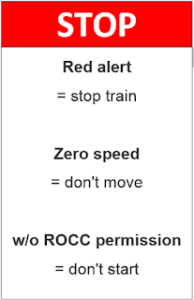
How about STOP.
Metro should start again. If they hired me, I’d start with two questions:
- Who is your audience? I believe they’re experienced train drivers who spend long shifts standing up. They’re focused on what’s directly ahead of them, and if they have time to read, would probably be while they’re at a dead stop in a station.
- What is the environment? Any small sign will be on the driver’s dashboard, near important gauges the driver is constantly monitoring. The dashboard is dark, and the train is most likely in a dark tunnel while moving.
A light background would draw the driver’s attention to the words. My headline would jump off the dashboard
This is a learning aid, a simple reminder. The message shouldn’t be teaching the driver a behavior but simply reinforcing something the driver already knows. Like good advertising, it should simply be a pleasant reinforcement.
Imagine if a driver saw “ROCC permission” 20 times out of the corner of his eye over two shifts. They’ll start thinking about ROCC permission each time they step into their cabs.
Now, Metro can focus on keeping their drivers engaged on the tracks throughout their drive, stay on track, and continue to keep all of us safe.